Changing a logo is a delicate process. You need to strike a balance of maintaining your visual identity with a business’s evolution. Since 2006, there have been four iterations of the EMD logo.
The Original
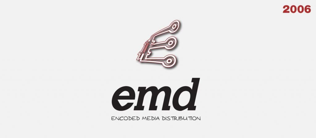
The company formed in 2006 as Encoded Media Distribution. The then-EMD developed an online media distribution platform. What does that mean? Think Netflix. We were, as I fondly remember, “six months ahead of Hulu.” But that’s a story for another day.
The strong slab-serifs of the acronym logotype (“EMD”) used modified letterforms of the typeface Calvert. The company name below it used a handwritten-style typeface, Augie. This informal approach suited the tone of the company at the time.
A lot changed in 2008
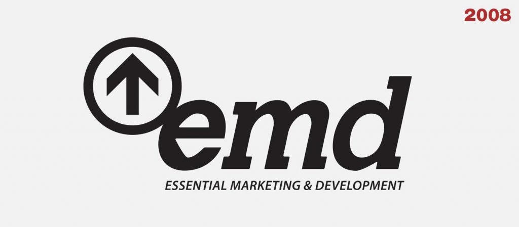
My role expanded in 2008 from Art Director and General Manager to an equal third partner. We also rebranded the company as Essential Marketing and Development, expanding the company’s scope away from the media distribution system to building websites and developing custom online software.
We maintained the core of the logotype with the strong slab-serif letterforms, and changed the full company name below it to the clean letterforms of the sans-serif typeface, Myriad Pro Semibold Italic. We added the arrow icon to coordinate with our new tagline, “Design for Success.”

My personal beliefs on the relationship of a logo icon and a typographic logotype began to crystalize during this period, and I see that reflected in much of my logo work over the years.
A new focus
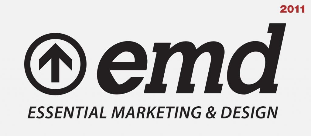
Becoming the sole proprietor in 2011, the company pivoted with a renewed focus on design rather than programming development. EMD became Essential Marketing and Design.
The changes to the logo at this time were subtler, primarily focused on the name change. I also moved the arrow icon to the left of the acronym. This allowed for more flexibility in sizing and application to various medium.
The icon (“The arrow in the circle”) became stronger through its isolation, which allowed the logotype to have a high degree of contrast and demand attention.
The current EMD logo
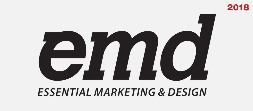
This all brings us to the current version of our logo. The changes here focused on clarity, removing the angled bowl of the E in the acronym, and adding a new serif to the E’s top left. We still use the up arrow icon in coordination with our media, but no longer directly with the logo. If you want to get fancy, you could say that we clarified our brand by focusing our logotype and extending our identity. But no one likes it when you talk like that, right?
Exploring the evolution of my company’s mark is a good exercise. We work with clients to design logos for them, or to re-imagine their existing logos. Most of the time we start from scratch. But sometimes what is needed most is clarification to focus on the existing soul within a logo.

